# basic usage
p <- ggplot2::ggplot(mtcars, ggplot2::aes(wt, mpg)) + ggplot2::geom_point()
ggMarginal(p)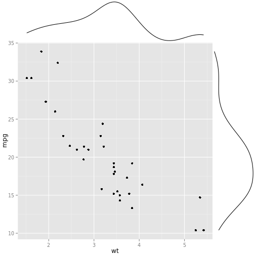
# using some parameters
set.seed(30)
df <- data.frame(x = rnorm(500, 50, 10), y = runif(500, 0, 50))
p2 <- ggplot2::ggplot(df, ggplot2::aes(x, y)) + ggplot2::geom_point()
ggMarginal(p2)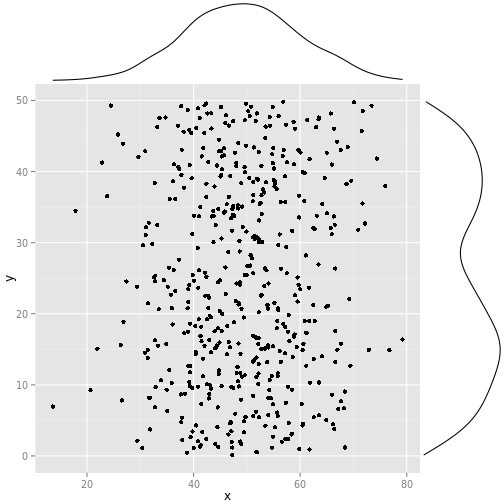
ggMarginal(p2, type = "histogram")## stat_bin: binwidth defaulted to range/30. Use 'binwidth = x' to adjust this.
ggMarginal(p2, margins = "x")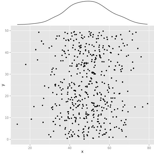
ggMarginal(p2, size = 2)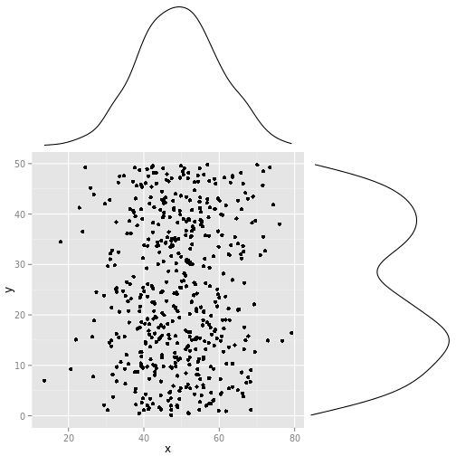
ggMarginal(p2, colour = "red")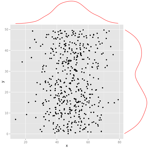
ggMarginal(p2, colour = "red", xparams = list(colour = "blue", size = 3))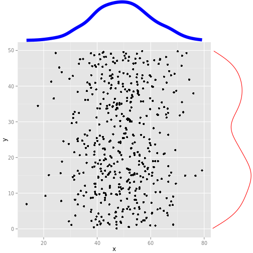
ggMarginal(p2, type = "histogram", bins = 10)## stat_bin: binwidth defaulted to range/30. Use 'binwidth = x' to adjust this.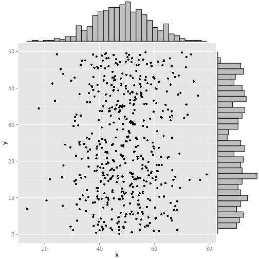
# specifying the data directly instead of providing a plot
ggMarginal(data = df, x = "x", y = "y")
# more examples showing how the marginal plots are properly aligned even when
# the main plot axis/margins/size/etc are changed
set.seed(30)
df2 <- data.frame(x = c(rnorm(250, 50, 10), rnorm(250, 100, 10)),
                  y = runif(500, 0, 50))
p2 <- ggplot2::ggplot(df2, ggplot2::aes(x, y)) + ggplot2::geom_point()
ggMarginal(p2)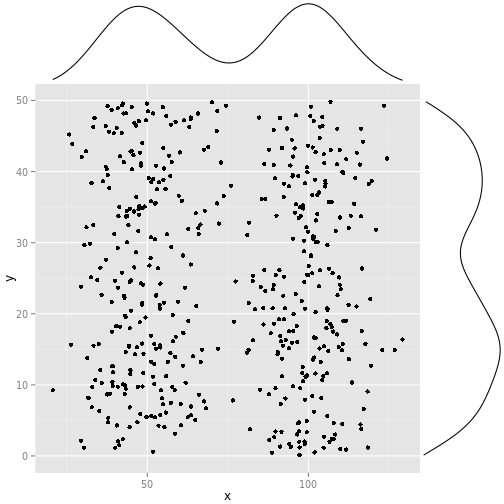
p2 <- p2 + ggplot2::ggtitle("Random data") + ggplot2::theme_bw(30)
ggMarginal(p2)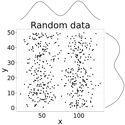
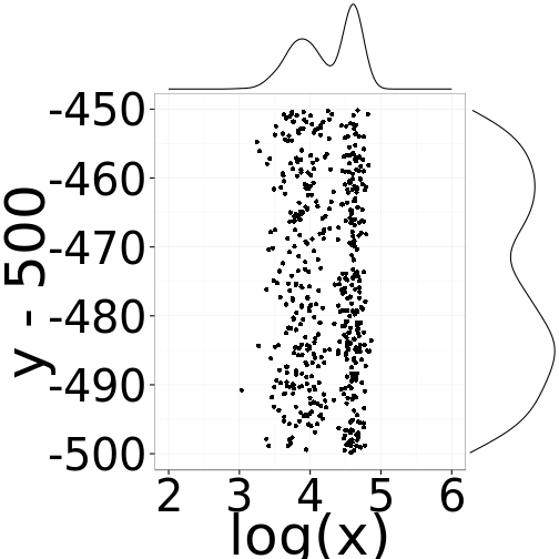
p3 <- ggplot2::ggplot(df2, ggplot2::aes(log(x), y - 500)) + ggplot2::geom_point()
ggMarginal(p3)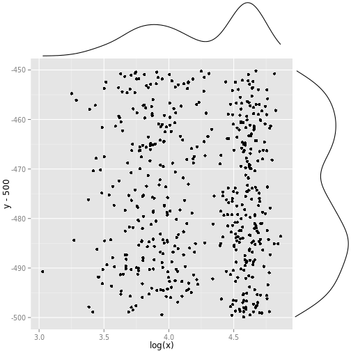
p4 <- p3 + ggplot2::scale_x_continuous(limits = c(2, 6)) + ggplot2::theme_bw(50)
ggMarginal(p4)