Introduction to gghighlight
Hiroaki Yutani
2025-06-14
Source:vignettes/gghighlight.Rmd
gghighlight.RmdMotivation
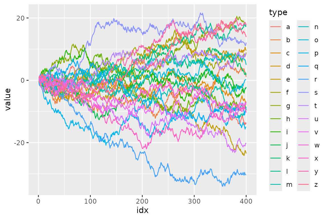
Suppose we have data that has so many series that it is hard to identify them by their colours as the differences are so subtle.
set.seed(2)
d <- purrr::map_dfr(
  letters,
  ~ data.frame(
      idx = 1:400,
      value = cumsum(runif(400, -1, 1)),
      type = .,
      flag = sample(c(TRUE, FALSE), size = 400, replace = TRUE),
      stringsAsFactors = FALSE
    )
)
To filter the data to a reasonable number of lines, we can use
dplyr’s filter().
library(dplyr, warn.conflicts = FALSE)

d_filtered <- d %>%
  group_by(type) %>%
  filter(max(value) > 20) %>%
  ungroup()

ggplot(d_filtered) +
  geom_line(aes(idx, value, colour = type))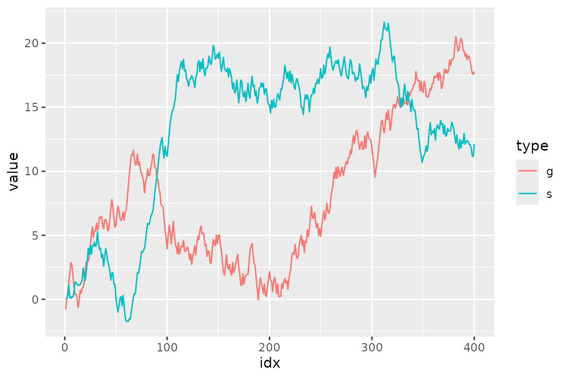
But, it seems not so handy. For example, what if we want to change
the threshold in predicate (max(value) > 20) and
highlight other series as well? It’s a bit tiresome to type all the code
above again every time we replace 20 with some other
value.
Besides, considering one of the main purposes of visualization is to get the overview of a data, it may not be good to simply filter out the unmatched data because the plot will lose its context.
Here comes gghighlight package, dplyr::filter()
equivalent for ggplot2.
(If you are interested in more details behind the idea of highlighting, please read this post: Anatomy of gghighlight.)
gghighlight()
The main function of the gghighlight package is
gghighlight(). For example, by using this function, we can
highlight the lines whose max values are larger than 20 as seen
below:
library(gghighlight)

ggplot(d) +
  geom_line(aes(idx, value, colour = type)) +
  gghighlight(max(value) > 20)
#> label_key: type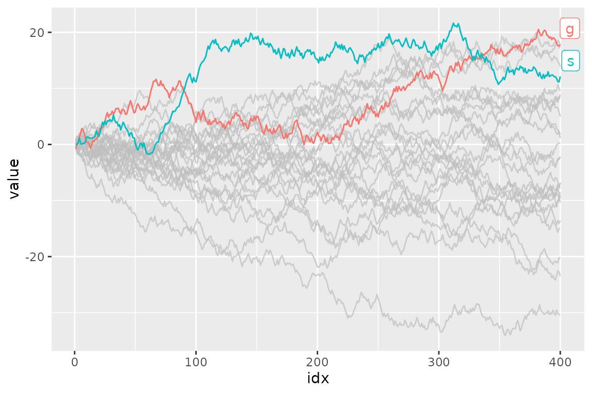
You can specify as many predicates as you like. For example, the
following code highlights the data that satisfies both
max(value) > 15 and
mean(flag) > 0.55.
ggplot(d) +
  geom_line(aes(idx, value, colour = type)) +
  gghighlight(max(value) > 15, mean(flag) > 0.5)
#> label_key: type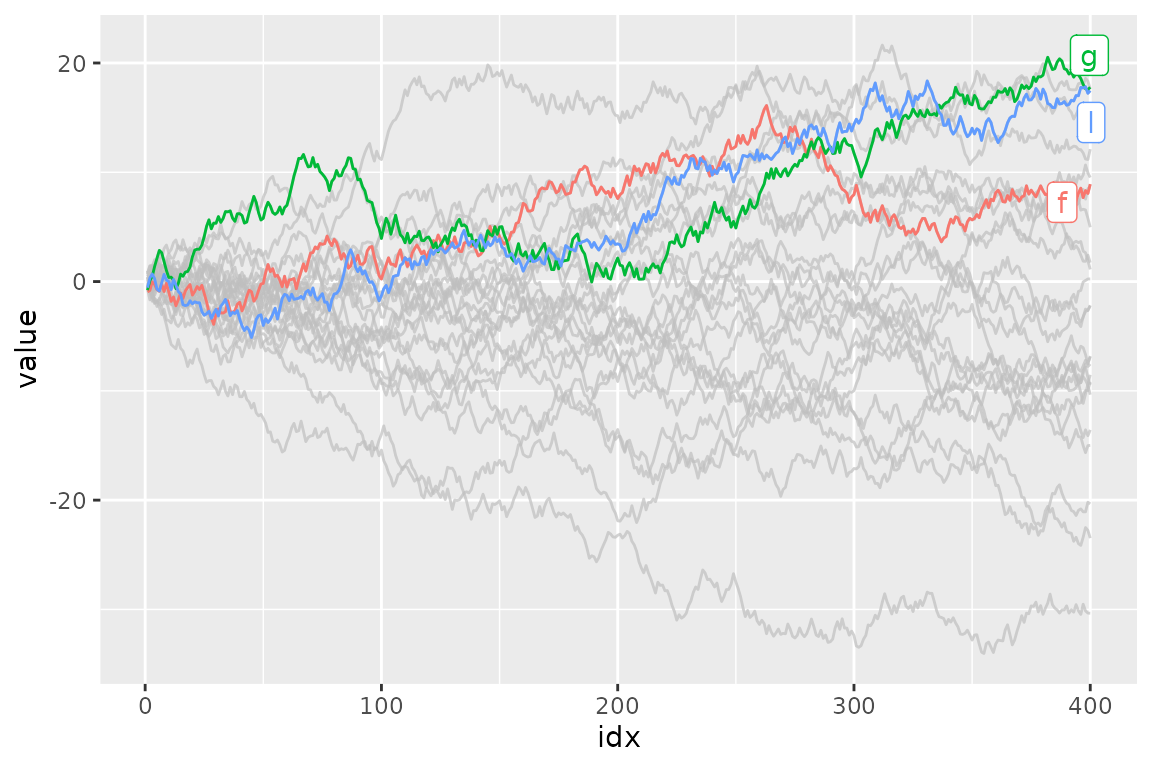
Customization
As adding gghighlight() results in a ggplot object, it
is fully customizable just as we usually do with ggplot2 like custom
themes.
ggplot(d) +
  geom_line(aes(idx, value, colour = type)) +
  gghighlight(max(value) > 19) +
  theme_minimal()
#> label_key: type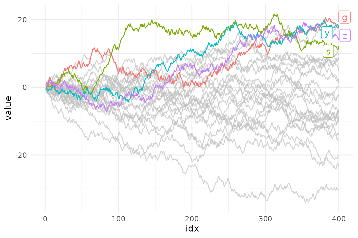
The plot also can be facetted:
ggplot(d) +
  geom_line(aes(idx, value, colour = type)) +
  gghighlight(max(value) > 19) +
  theme_minimal() +
  facet_wrap(~ type)
#> label_key: type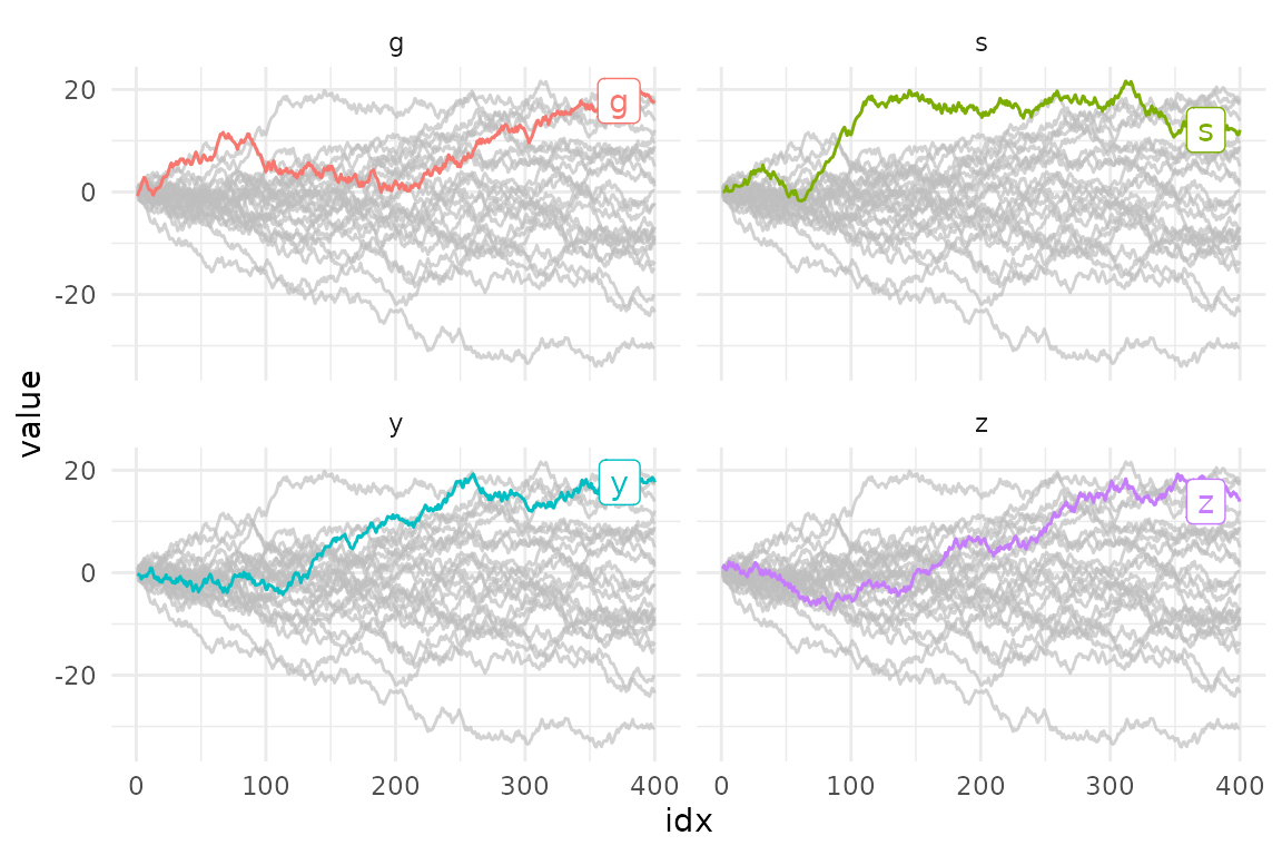
There are also some options to control the way of highlighting. See “Options” section below.
Geoms
gghighlight() can highlight almost every geom. Here are
some examples.
Bar
gghighlight() can highlight bars.
p <- ggplot(iris, aes(Sepal.Length, fill = Species)) +
  geom_histogram() +
  gghighlight()
#> label_key: Species

p
#> `stat_bin()` using `bins = 30`. Pick better value with `binwidth`.
#> `stat_bin()` using `bins = 30`. Pick better value with `binwidth`.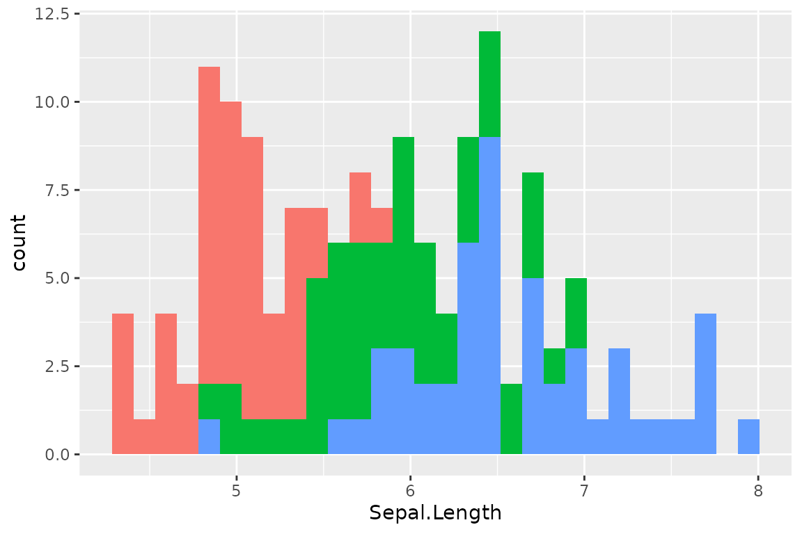
Are you wondering if this is really highlighted? Yes, it is. But, the unhighlighted bars are all overwritten by the highlighted bars. This seems not so useful, until you see the facetted version:
p + facet_wrap(~ Species)
#> `stat_bin()` using `bins = 30`. Pick better value with `binwidth`.
#> `stat_bin()` using `bins = 30`. Pick better value with `binwidth`.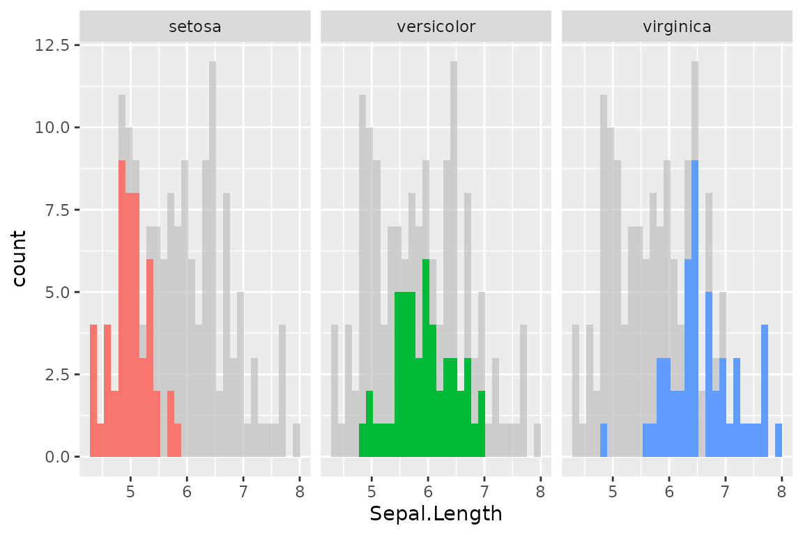
Point
As is explained in Anatomy
of gghighlight, lines and points typically have different semantics
(group-wise or not). But, in most cases, you don’t need to be careful
about the difference with gghighlight() because it
automatically picks the right method of calculation.
set.seed(10)
d2 <- dplyr::slice_sample(d, n = 20)

ggplot(d2, aes(idx, value)) +
  geom_point() +
  gghighlight(value > 0, label_key = type)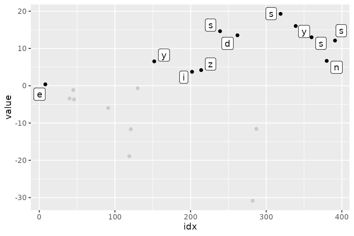
More precisely, gghighlight() takes the following
strategy:
- Calculate the group IDs from mapping.
- If
groupexists, use it. - Otherwise, assign the group IDs based on the combination of the values of discrete variables.
- If
- If the group IDs exists, evaluate the predicates in a grouped manner.
- If the group IDs doesn’t exist or the grouped calculation fails, evaluate the predicates in an ungrouped manner.
Note that, in this case, label_key = type is needed to
show labels because gghighlight() chooses a discrete
variable from the mapping, but aes(idx, value) consists of
continuous variables only.
Non-logical predicate
To construct a predicate expression like below, we need to determine
a threshold (in this example, 20). But it is difficult to
choose a nice one before we draw plots.
max(value) > 20So, gghighlight() allows predicates that return
non-logical (e.g. numeric and character) results. The values are used
for sorting data and the top max_highlight of rows/groups
are highlighted:
ggplot(d, aes(idx, value, colour = type)) +
  geom_line() +
  gghighlight(max(value), max_highlight = 5L)
#> label_key: type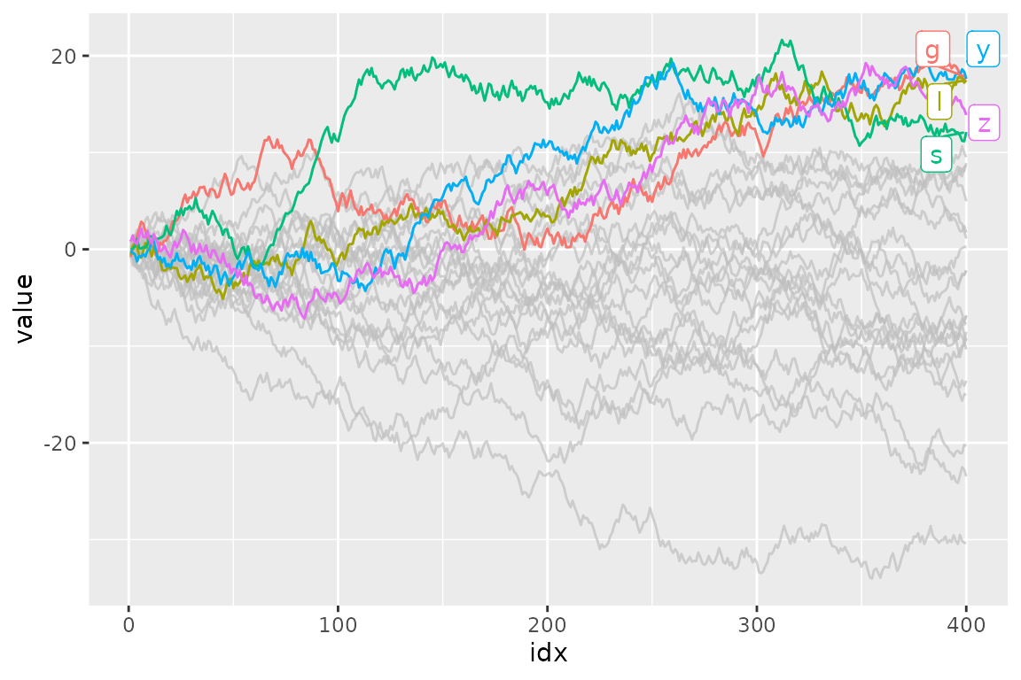
Labels
gghighlight() adds direct labels for some geoms.
Currently, the following geoms are supported:
-
point: add labels at each highlighted point. -
line: add labels at the right end of each highlighted line. -
bar: (do not add labels)
If you don’t want them to be labelled automatically, you can specify
use_direct_label = FALSE
ggplot(d) +
  geom_line(aes(idx, value, colour = type)) +
  gghighlight(max(value) > 20, use_direct_label = FALSE)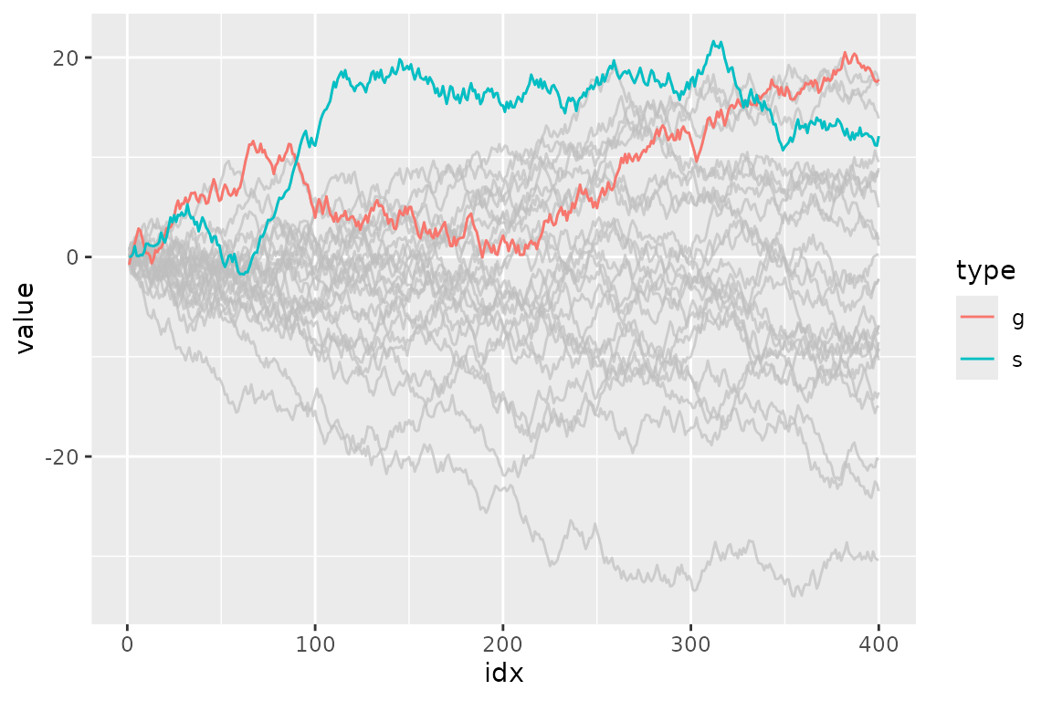
Labels are drawn by geom_label_repel(). If you want to
customize the labels, you can pass parameters to it via
label_params.
ggplot(d) +
  geom_line(aes(idx, value, colour = type)) +
  gghighlight(max(value) > 20, label_params = list(size = 10))
#> label_key: type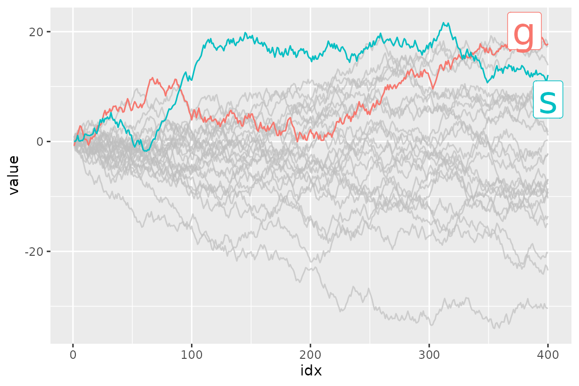
You can also add labels by yourself. It is easy to add labels on only
highlighted data because gghighlight() replaces the plot’s
data to the filtered one.
p <- ggplot(d2, aes(idx, value)) +
  geom_point(size = 4) +
  gghighlight(value > 0, use_direct_label = FALSE)

# the filtered data
p$data
#>    idx      value type  flag
#> 3  380  6.6660069    n FALSE
#> 4    8  0.3777038    e  TRUE
#> 5  262 13.5285254    d FALSE
#> 6  391 12.1243689    s  TRUE
#> 7  339 16.0241787    y FALSE
#> 9  239 14.6301167    s FALSE
#> 12 202  3.7365540    i FALSE
#> 14 152  6.5393768    y FALSE
#> 16 319 19.2898939    s FALSE
#> 17 360 13.0007351    s FALSE
#> 20 214  4.1910452    z FALSE

p + geom_label(aes(label = type),
               hjust = 1, vjust = 1, fill = "purple", colour = "white", alpha= 0.5)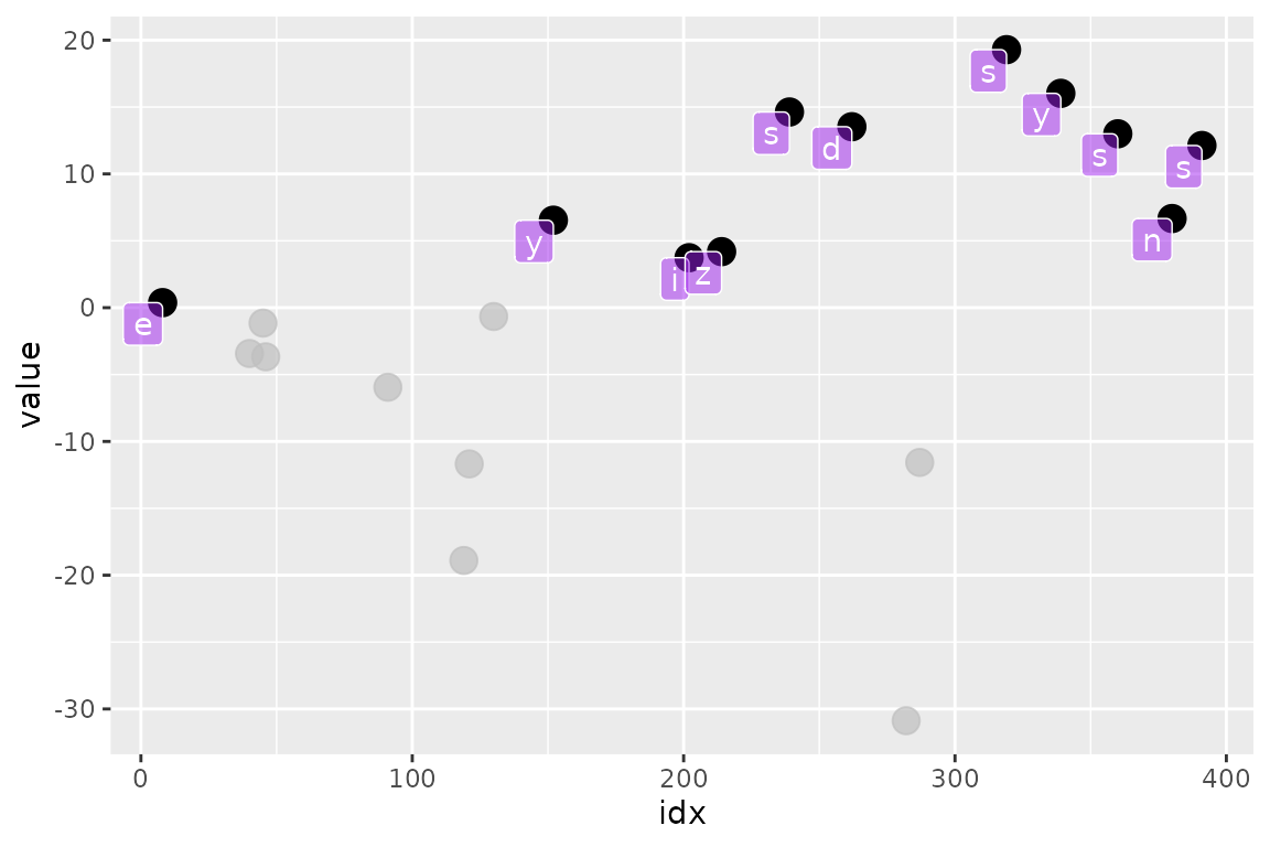
Options
unhighlighted_params
If you want to change the style of unhighlighted layers, use
unhighlighted_params.
ggplot(d) +
  geom_line(aes(idx, value, colour = type), linewidth = 5) +
  gghighlight(max(value) > 19,
              unhighlighted_params = list(linewidth = 1, colour = alpha("pink", 0.4)))
#> label_key: type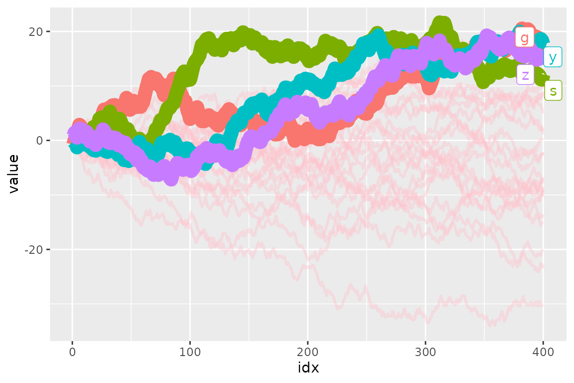
You can also specify NULL to fill or
colour to preserve the original color.
ggplot(d) +
  geom_line(aes(idx, value, colour = type)) +
  gghighlight(max(value) > 19,
              # preserve colour and modify alpha instead
              unhighlighted_params = list(colour = NULL, alpha = 0.3))
#> label_key: type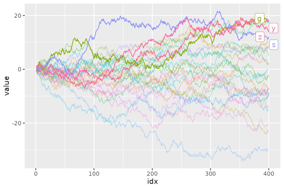
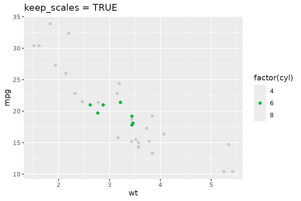
keep_scales
If you want to keep the original scales, set keep_scales
to TRUE.
p <- ggplot(mtcars, aes(wt, mpg, colour = factor(cyl))) +
  geom_point()

p + gghighlight(cyl == 6)
#> Warning: Tried to calculate with group_by(), but the calculation failed.
#> Falling back to ungrouped filter operation...

p + gghighlight(cyl == 6, keep_scales = TRUE) + ggtitle("keep_scales = TRUE")
#> Warning: Tried to calculate with group_by(), but the calculation failed.
#> Falling back to ungrouped filter operation...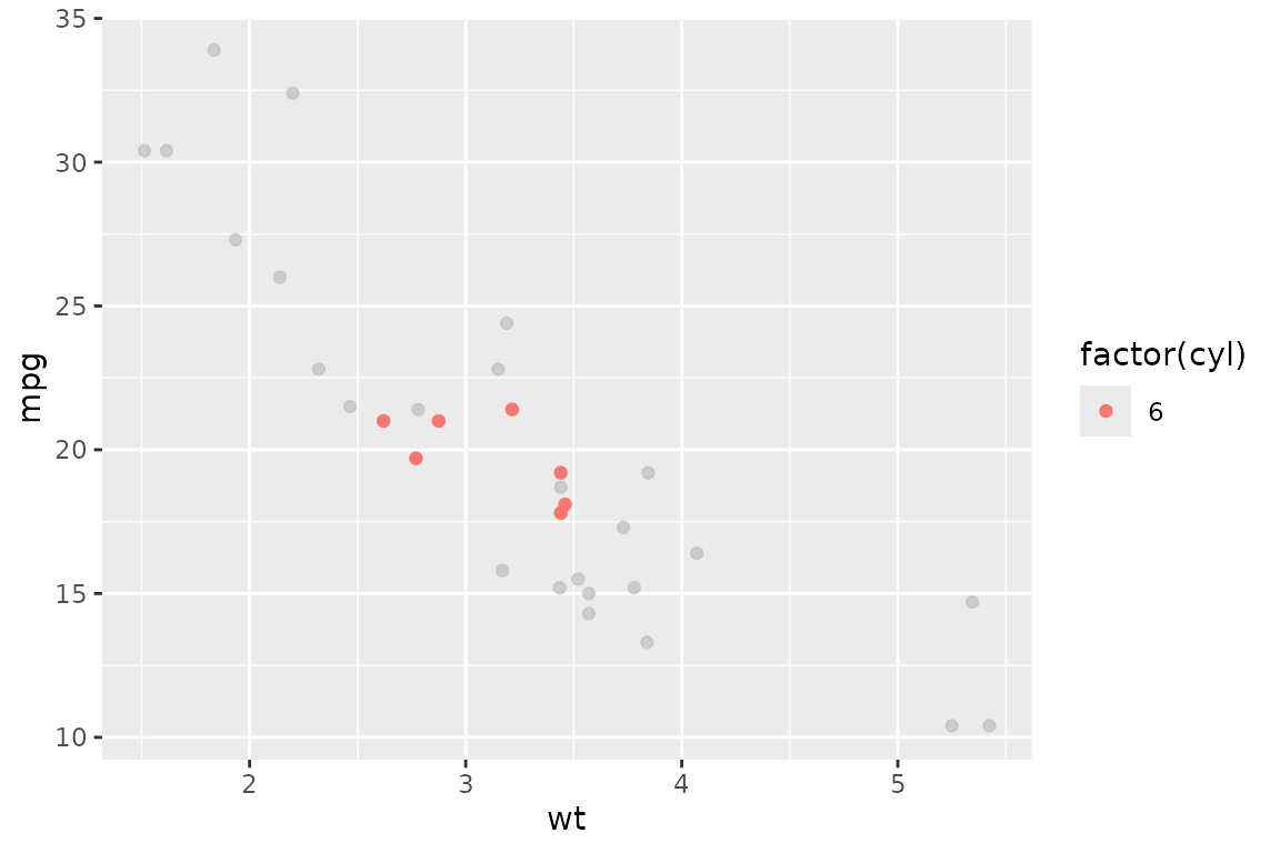
calculate_per_facet
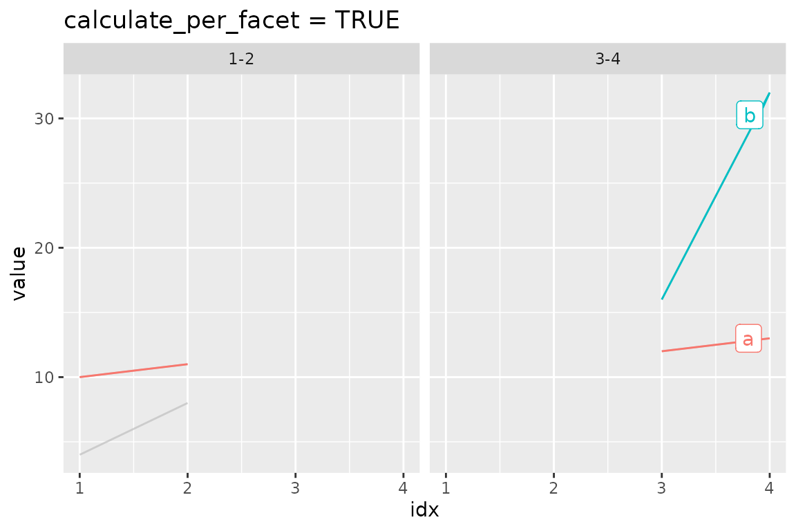
If you want to highlight each facet individually, set
calculate_per_facet to TRUE. Note that
gghighlight() affects the plot before
gghighlight(). If you add facet_*() after
adding gghighlight(), this option doesn’t work.
d <- data.frame(
  idx =   c(1, 2, 3, 4, 1, 2, 3, 4),
  value = c(10, 11, 12, 13, 4, 8, 16, 32),
  cat1 =  rep(c("a", "b"), each = 4),
  cat2 =  rep(rep(c("1-2", "3-4"), each = 2), 2),
  stringsAsFactors = FALSE
)

p <- ggplot(d, aes(idx, value, colour = cat1)) +
  geom_line() +
  facet_wrap(vars(cat2))

p +
  gghighlight(max(value) > 10)
#> label_key: cat1

p +
  gghighlight(max(value) > 10, calculate_per_facet = TRUE) +
  ggtitle("calculate_per_facet = TRUE")
#> label_key: cat1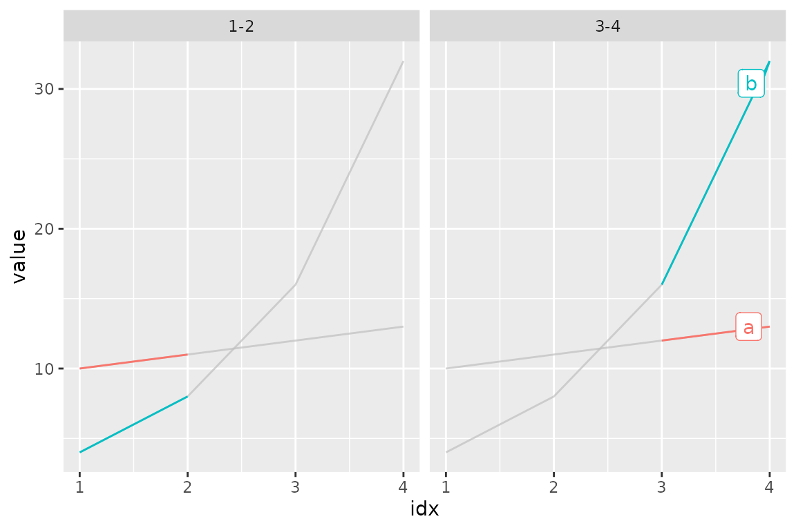
line_label_type (experimental)
By default, gghighlight uses the ggrepel
package for labeling lines. You can change the method by
line_label_type argument. The options are:
-
"ggrepel_label"(default): Useggrepel::geom_label_repel(). -
"ggrepel_text": Useggrepel::geom_text_repel(). -
"text_path": Usegeomtextpath::geom_textline()for lines andgeomtextpath::geom_textpath()for paths. -
"label_path": Usegeomtextpath::geom_labelline()for lines andgeomtextpath::geom_labelpath()for paths. -
"sec_axis": Use secondary axis. Please refer to Simon Jackson’s blog post for the trick.
d <- data.frame(
  x = rep(1:3, times = 3),
  y = c(1:3, 2, 4, 2, 0, 1, 1),
  id = rep(c("a", "b", "c"), each = 3)
)

p <- ggplot(d) +
  geom_line(aes(x, y, colour = id))

p +
  gghighlight(max(y) >= 3, line_label_type = "label_path", label_params = list(size = 10)) +
  ggtitle('line_label_type = "label_path"')
#> label_key: id

p +
  gghighlight(max(y) >= 3, line_label_type = "sec_axis") +
  ggtitle('line_label_type = "sec_axis"') +
  theme(axis.text.y.right = element_text(size = 20))
#> label_key: id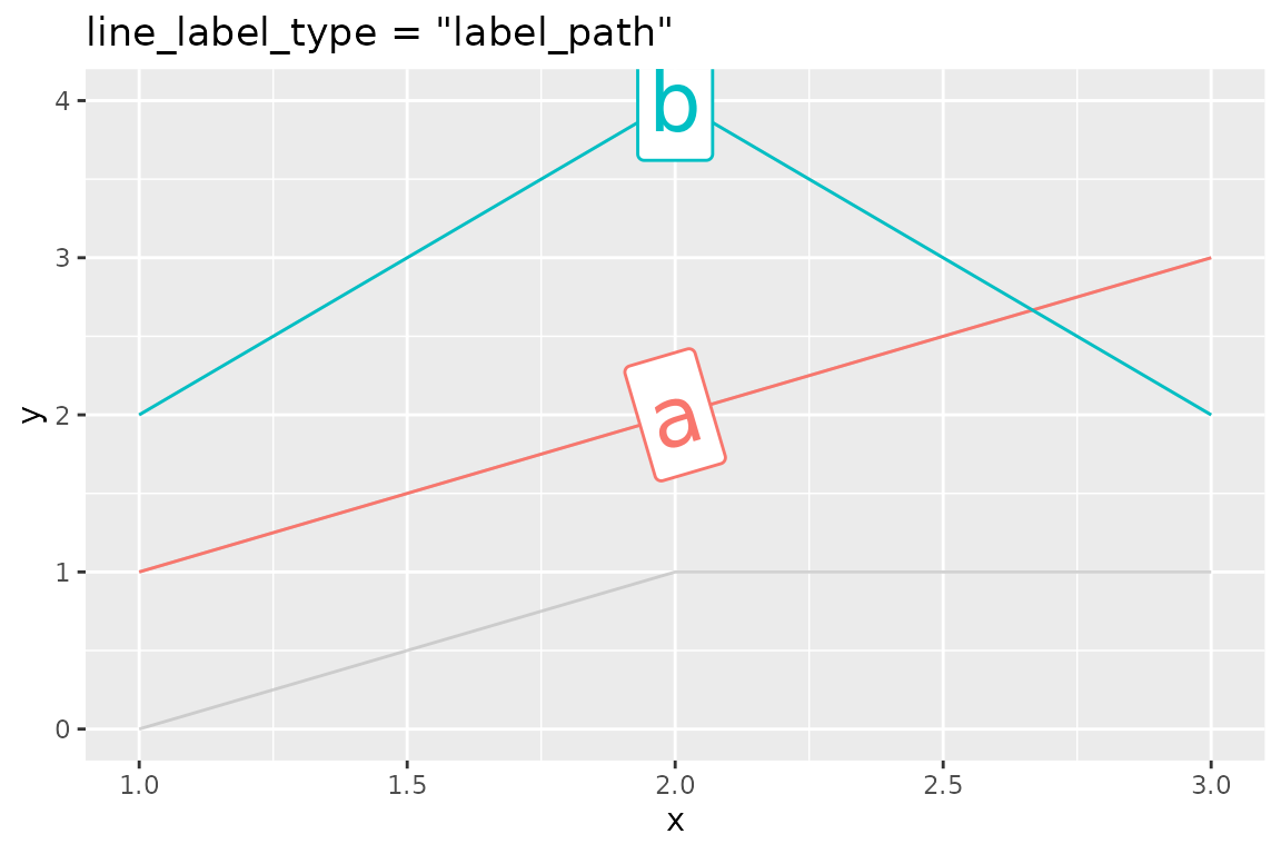
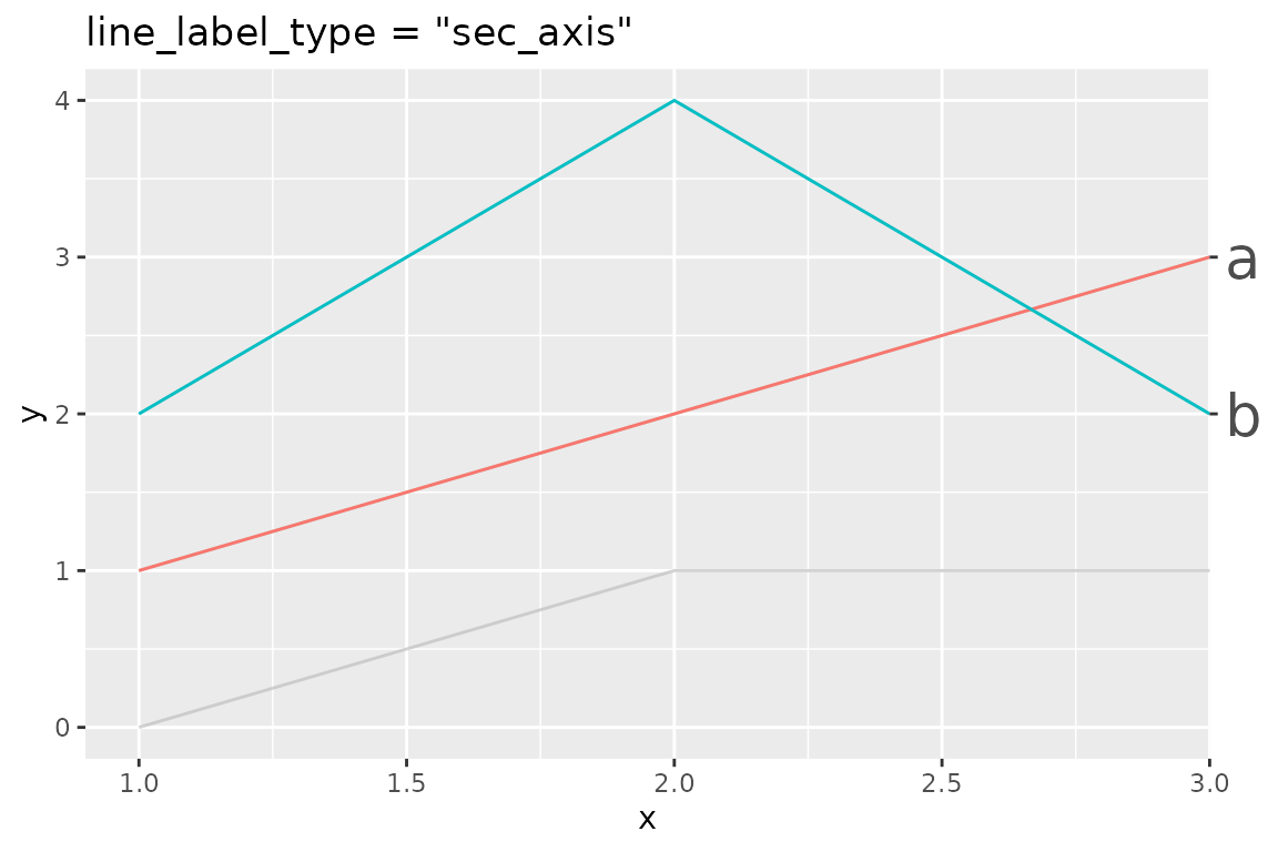
Note that, while this looks good for this example, there are some limitations:
- Unlike ggrepel, there’s no mechanism to avoid overlapping. You’ll
probably want to choose
ggrepel_labelorggrepel_textwhen the data has many series. - Since
"sec_axis"is a very different approach than the other, somelabel_paramsare ignored. For example, if you want to change the text size of the labels, you need to specify it viaggplot2::theme()instead oflabel_params.