Export a ggplot2 map plot (e.g. geom_sf()) or a tmap map as a QGIS project (.qgs) file.
write_qgs() takes a ggplot2 plot or a tmap object whose layers are backed by sf objects (see Vector below) or by rasters (see Raster) and writes a QGIS project. The data of each layer is saved as a GeoPackage (a GeoTIFF for raster layers) alongside the .qgs, and each layer is styled after the plot’s trained color scale:
- a continuous
fill/colourscale becomes a graduated renderer (or a continuously interpolated color, seegradient_style), - a binned scale (e.g.
scale_fill_steps()) becomes a graduated renderer with the scale’s exact bins, - a discrete scale becomes a categorized renderer,
- a layer with no
fill/colourmapping becomes a single symbol with the color ggplot2 would have used.
Installation
You can install ggplot2qgis via R-universe:
install.packages("ggplot2qgis", repos = c("https://yutannihilation.r-universe.dev", "https://cloud.r-project.org"))Vector
A vector layer’s data is saved as a GeoPackage table and the layer gets a symbol renderer. Constant outline colors and widths, and constant line types (linetype / lty), are carried over as well.
ggplot2
geom_sf() on an sf object is the base case:
library(ggplot2)
library(ggplot2qgis)

nc <- sf::st_read(system.file("shape/nc.shp", package = "sf"), quiet = TRUE)

p <- ggplot(nc) +
  geom_sf(aes(fill = AREA))

write_qgs(p, "nc.qgs")
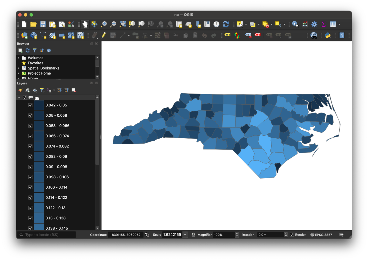
Open nc.qgs in QGIS: the polygons are rendered with the same fill gradient as the ggplot2 plot, and the data lives in nc_data/.
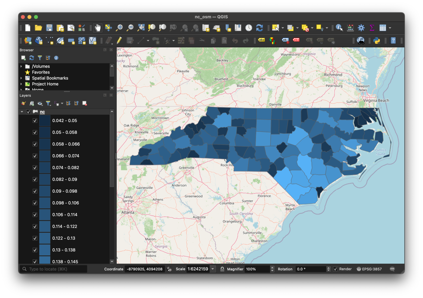
To add an XYZ tile basemap below the layers, pass basemap a predefined key or an XYZ URL template:
write_qgs(p, "nc.qgs", basemap = "osm")
geom_sf_text() and geom_sf_label() become labels-only QGIS layers drawn by QGIS’s own labeling engine, and geom_point(), geom_path(), geom_line() and geom_polygon() on a plain data frame are converted to sf layers (the plot must use coord_sf()).
Beyond the colors, the constants ggplot2 computed for a layer are carried over: linewidth and linetype, and on a point layer size / stroke as the marker’s size in millimeters, shape as the QGIS marker of the same outline, and alpha as the alpha component of the colors ggplot2 applies it to (a polygon’s interior but not its border, a line’s color, both colors of a marker).
See ?write_qgs for the full set of options (use_plot_crs, gradient_style, basemap).
tidyterra
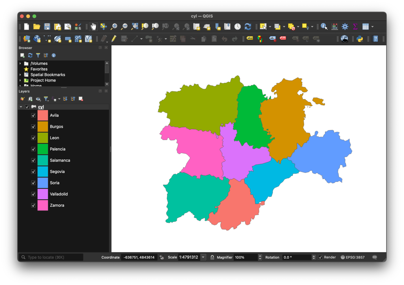
tidyterra’s geom_spatvector() (and geom_spatvector_text() / geom_spatvector_label()) works too — they are wrappers of geom_sf(), and tidyterra’s fortify() method turns the SpatVector into an sf object, so such a layer is styled by exactly the same rules:
library(tidyterra)

cyl <- terra::vect(system.file("extdata/cyl.gpkg", package = "tidyterra"))

p <- ggplot(cyl) +
  geom_spatvector(aes(fill = name))

write_qgs(p, "cyl.qgs")
tmap
A tmap (>= 4.4) object works the same way, reproducing tmap’s own trained color scales (tm_scale_intervals() with its exact class boundaries, tm_scale_categorical(), tm_scale_continuous()) and converting tm_basemap() to an XYZ tile layer:
library(tmap)

nc <- sf::st_read(system.file("shape/nc.shp", package = "sf"), quiet = TRUE)

x <- tm_basemap("OpenStreetMap") +
  tm_shape(nc) +
  tm_polygons(fill = "AREA")

write_qgs(x, "nc_tmap.qgs")
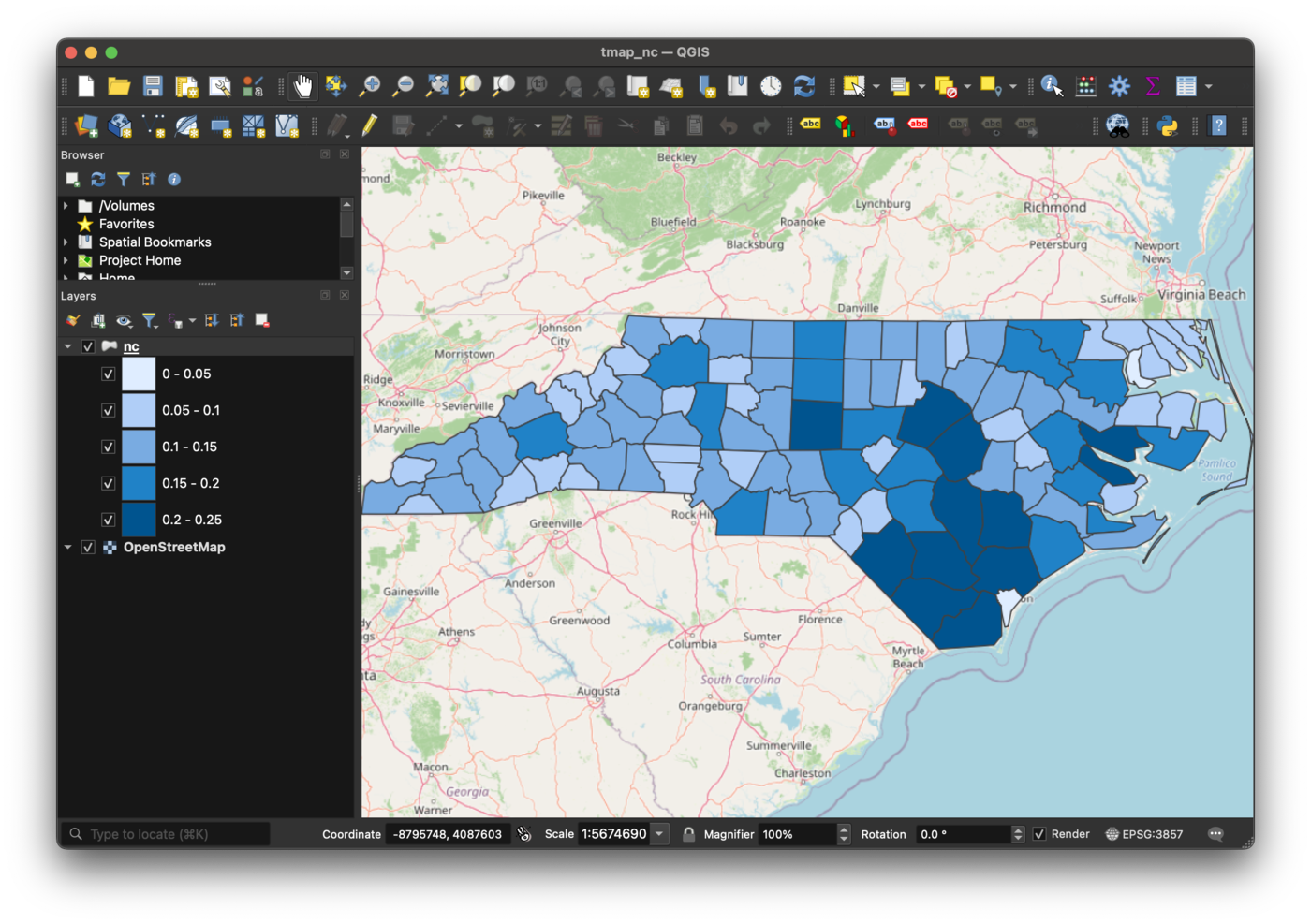
tm_polygons() / tm_fill() / tm_borders(), tm_lines() and the symbol layers (tm_symbols() / tm_dots() / tm_bubbles() / tm_squares(), on point shapes) are supported. Beyond the colors, the constants tmap computed for the layer — lwd, lty, size, shape, fill_alpha and col_alpha — are carried over: the marker size in millimeters, the pch translated to the QGIS marker of the same outline, and the alphas as the alpha component of the respective colors.
Raster
A raster layer’s data is written as a GeoTIFF next to the project, and missing cells become the GeoTIFF’s nodata value.
tidyterra
geom_spatraster() becomes a single-band pseudocolor layer whose color ramp reproduces the plot’s continuous fill scale:
library(tidyterra)

volcano2 <- terra::rast(system.file("extdata/volcano2.tif", package = "tidyterra"))

p <- ggplot() +
  geom_spatraster(data = volcano2) +
  scale_fill_whitebox_c()

write_qgs(p, "volcano.qgs")
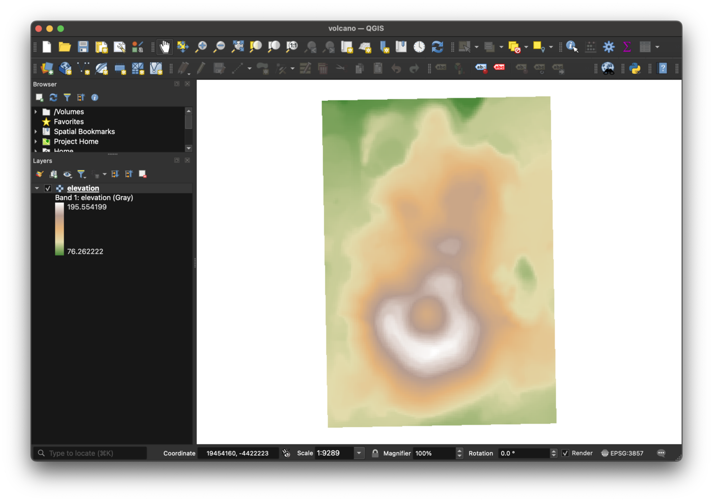
geom_spatraster_rgb() becomes a multiband (true color) layer instead, with the layer’s r/g/b band selection, its zlim/stretch rescaling and its constant alpha carried over.
geom_spatraster_contour() is the exception: it draws lines, so it becomes a GeoPackage-backed line layer with one feature per contour line, keeping the contour value as a level attribute. Mapping colour to after_stat(level) renders it through the same scale machinery as a vector layer:
p <- ggplot() +
  geom_spatraster(data = volcano2) +
  geom_spatraster_contour(data = volcano2, aes(colour = after_stat(level)))

write_qgs(p, "volcano_contour.qgs")
The raster becomes elevation and the lines elevation_contour.
geom_spatraster_contour_filled() becomes a polygon layer instead: one feature per contour band, with the holes punched by the bands above it kept as holes. Its fill is always the band the stat computed, so the layer gets a categorized renderer keyed on the band label ("(70, 80]" and so on):
p <- ggplot() +
  geom_spatraster_contour_filled(data = volcano2) +
  geom_spatraster_contour(data = volcano2)

write_qgs(p, "volcano_bands.qgs")
The bands become elevation_contour_filled and the lines on top of them elevation_contour.
geom_spatraster_contour_text() draws the same lines with their value written along them, so it becomes that same line layer with QGIS labeling switched on. The text is written as a label attribute, run through the geom’s label_format — so a custom format is reproduced as it is:
p <- ggplot() +
  geom_spatraster_contour_text(
    data = volcano2,
    label_format = scales::label_number(suffix = " m")
  )

write_qgs(p, "volcano_contour_text.qgs")
The layer becomes elevation_contour_text, labeled "80 m", "90 m", … in the geom’s text size, font family and color. QGIS places each label on its line and masks the line under it, reproducing the gap ggplot2 breaks there. Mapping colour colors the lines through the same scale machinery as the plain isolines, but a QGIS labeling has a single text color, so every label is drawn in the first feature’s, with a warning.
tmap
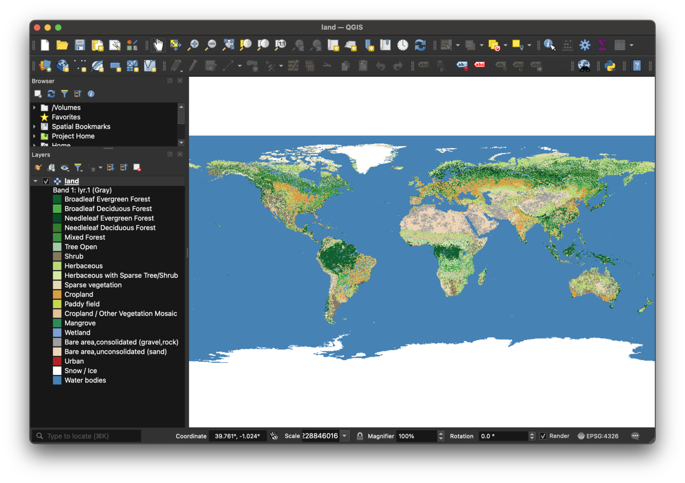
tm_raster() on a raster shape (a stars object, a SpatRaster or a RasterLayer) becomes a QGIS raster layer, with the classes, colors and legend labels tmap trained — a discrete color ramp for tm_scale_intervals(), a paletted renderer for a categorical one, an interpolated ramp for tm_scale_continuous():
library(stars)

data(land, package = "tmap")

x <- tm_shape(land) + tm_raster("cover")

write_qgs(x, "land.qgs")