# Basketball statistics provided by Nathan Yau at Flowing Data.
nba <- read.csv("http://datasets.flowingdata.com/ppg2008.csv")
# Default output.
ggcorr(nba[, -1])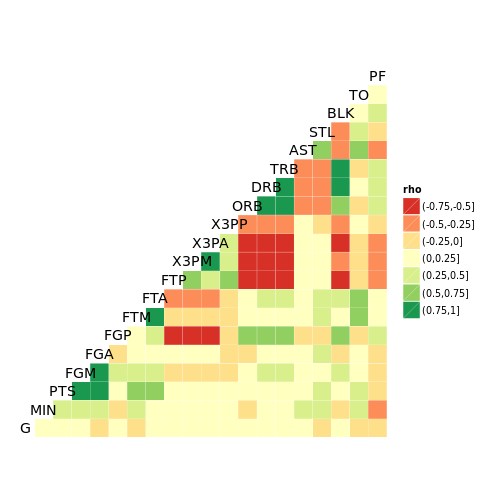
# Labelled output, with coefficient transparency.
ggcorr(nba[, -1],
       label = TRUE,
       label_alpha = TRUE,
       name = "") +
  ggplot2::theme(legend.position = "bottom")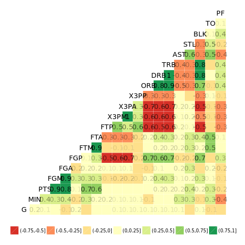
# Custom options.
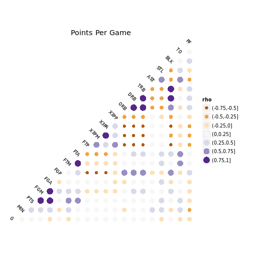
ggcorr(
nba[, -1],
geom = "circle",
max_size = 6,
size = 3,
hjust = 0.75,
angle = -45,
palette = "PuOr" # colorblind safe, photocopy-able
) + ggplot2::labs(title = "Points Per Game")## Warning: Removed 210 rows containing missing values (geom_point).